Where can I see how the account is performing?
Interpreting topline KPI's
As a knowledge manager day to day, once the account is live, this would be the first page you would see when logging into the console.
The topline metrics give a good indication of how the account is performing:
- Successfully handled is a successful conversation. The user engages with a query that is resolved one way or another by the widget - this includes an escalation as a 'successful resolution' as the only way in which a particular query can be answered but not if the escalation is as a result of missing knowledge. (e.g. if canceling a subscription requires interaction with a human that cannot be automated, Kare has identified the issue but is unable to automate the fix, therefore the knowledge was accurate but the response still requires escalation)
- Successfully deflected is where the has self-served from hardwired responses or documents in the knowledge source, without the need for an escalation, thus deflecting the query entirely without any CS intervention.
- Successfully automated refers to where Kare automation has successfully resolved the conversation through either search response, workflows, and/or RPA's that are in place. This may not be an indication of the accuracy of the search as customers may answer their query through a dialogue flow direct from the welcome message, without searching. It is however an indication of good UX.
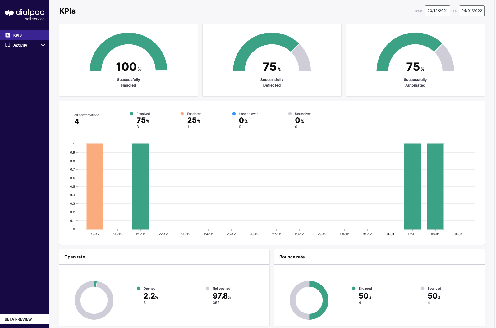
All conversations overview
The “all conversations” bar chart breaks down conversations according to whether they have been:
- resolved
- unresolved (where the user has stopped the interaction without finding an answer)
- “escalated” (in this context we use escalated to refer to where there is missing knowledge and the user was forced to escalate
- Handed Over (this is also referred to as a graceful escalation, where the user is guided by the knowledge towards an escalation as the only way to resolve their query e.g. cancellation)
Engagement metrics
Engagement metrics can give you an accurate idea of where changes may be needed in order to maximize traffic through the widget. Dialpad Self Service analyses:
- The open rate (how often visitors to the site are opening the widget) – For a customer-facing deflection tool, this number should usually be between 1-5%. Less than one percent could be a sign that the FAB may need an alteration in terms of style, positioning, size, or deployment location; or it could be an indication that a pop-over might be useful to drive engagement. Over five percent might suggest that there are fundamental issues with the website that need to be addressed. For agent assist deployments the expected open rate would be much higher.
- The bounce rate (this indicates what percentage of users who open the widget will then engage with it) – This can provide insight into the effectiveness of the welcome message and look and feel of the widget in terms of encouraging engagement. The industry average here is approximately 50%, however with the highly configurable setup that Dialpad Self Service can offer, our average is approximately 60% across all existing accounts.
- Content feedback (this is a binary thumbs up thumbs down – it is more useful to look at the total numbers rather than the percentages) – this metric should be analyzed by looking at the total number of thumbs down responses against the total number of queries in the all queries graph. If the number is high then it is advisable to analyze and improve the content of your responses and workflows. Specific conversations that have elicited a thumbs-down response can be found on the activity page.
We can also divide customers by:
- Users vs visitors – See developer notes on how to segregate users in the console using an existing tag management system.
- Traffic source by device type and OS (mobile vs desktop; mac OS X vs Windows etc) – This gives you an idea of your primary user when it comes to configuring the widget for your audience (if your customer base is predominantly on mobile for example then this should be your first consideration when it comes to configuring your widget for deployment.)
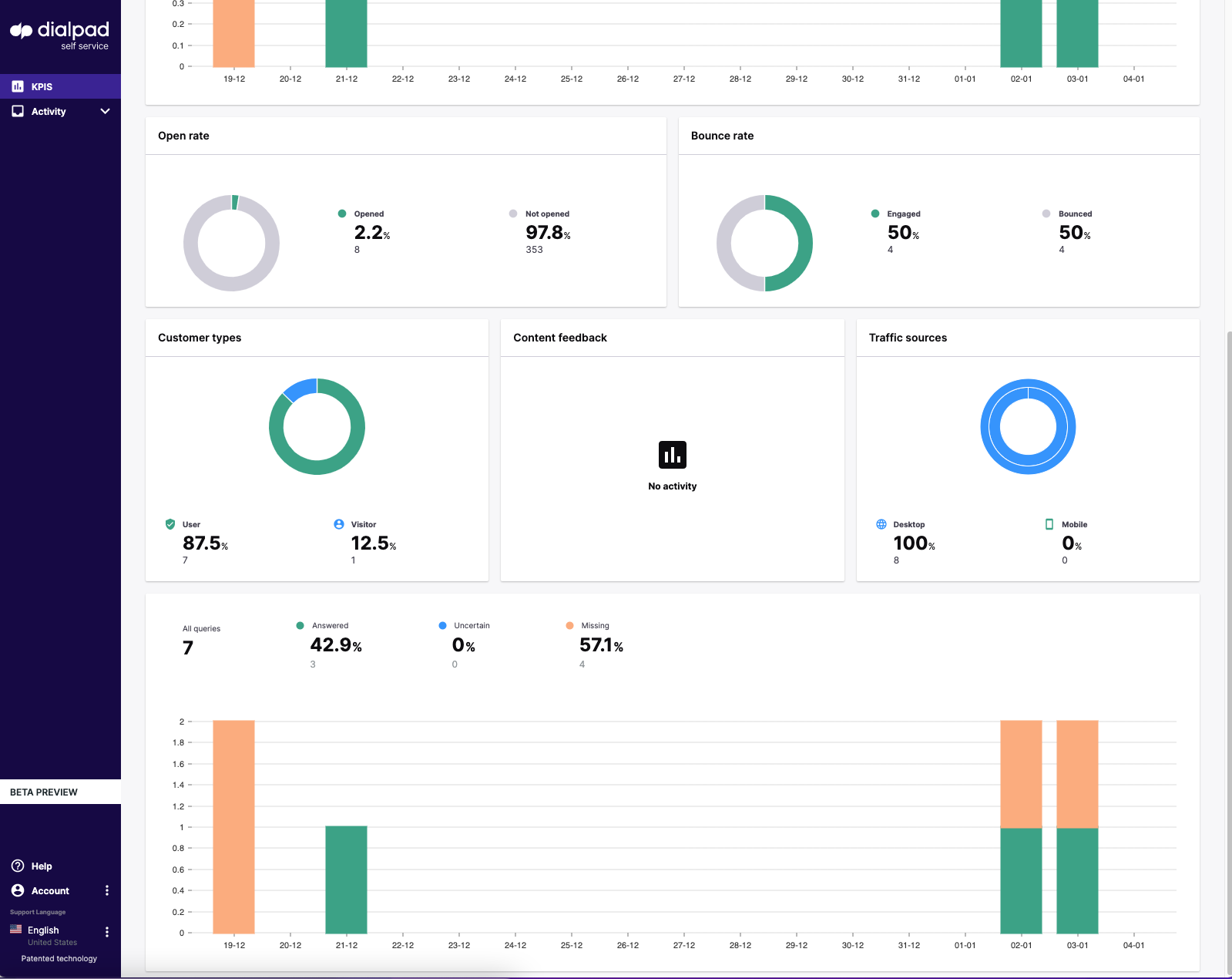
All queries overview
The “all queries” bar chart breaks down how successful the search has been in answering individual queries:
- Answered – a one for one response
- Uncertain – the system finds a range of appropriate responses, it is incumbent then on the user to select the most appropriate response to address their query from the list
- Missing – this is where the system is highlighting missing knowledge gaps to be plugged
How do I analyze the quality of the knowledge?
Knowledge graph precision & node review
You can find this page by navigating to Dashboard > Knowledge > Knowledge performance.
This provides the knowledge manager with an overview of what needs to be done in terms of expanding and improving the knowledge as the AI parent.
The knowledge graph precision tool provides an accurate indication of the knowledge precision in the account:
- The blue P@1 line indicates the system is able to find the correct search result without the need for disambiguation.
- The yellow P@5 (precision @ 5) line denotes where the search is accurate at 5 according to the number of correct results divided by the number of all returned results.
- i.e. the system is able to find the correct search result from a range of 5 responses.
- The green line refers to the overall perceived precision of the graph (and thus the search)
Node types break down the different types of knowledge article (“nodes”) contained in the instance:
- Library refers to crawled or uploaded documents
- Responses (hardwired responses)
- Chattering (chatter messages)
Broken nodes indicate where there are broken links either with crawled content where URLs have changed or dialogues that may contain obsolete or archived responses.
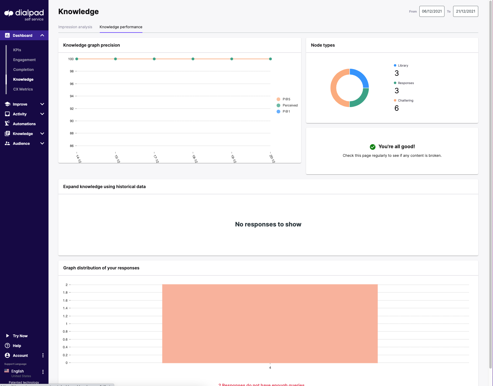
Historical data treemap
The treemap: “Expand knowledge using historical data” shows aggregated queries that the knowledge manager has to approve for the knowledge base. These are displayed as “improve cards” with 4 different color-coded denotations:
Blue Improve cards are where the system is showing multiple choice answers and suggesting to the admin they need to improve the experience by creating a dialogue or selecting the correct answer.
Green Improve cards are where the system has answered the query with what it believes is the correct response, however, confirmation is required by the admin to either approve the response, create a new response or select an alternative answer.
Yellow Improve cards are where the system has answered the query with what it believes is the correct response from content found directly in documents, however, confirmation is required by the admin to either approve the response, create a new response or select an alternative answer.
Red indicates there was no knowledge the system could find, so either you need to select a response if you believe this is wrong or create a new response. These are your newly discovered use cases.
The improve cards generated in this treemap are found in the ‘expand’ tab in the Improve section.
Graph distribution of responses
At the bottom of the page is the graph distribution of responses, which shows how many queries you have against your hard-wired responses in graph format. The optimum range in terms of the number of queries against each response is 5-49, if a response has less than 5 or more than 50, the system will indicate this so that the KM can improve the precision by rectifying.
How can I improve the quality of the knowledge?
Expanding the knowledge base
The Blue, Green, and Yellow cards, where the system has identified that there is existing knowledge for approval, are found under the “expand knowledge” section. You can find this by navigating: Improve>Expand
The Red missing knowledge cards are found under “missing knowledge”
This section allows the KM to go through each card one by one after the other in order for ease. There is the option on the right-hand side to either approve the response (green, yellow cards), select the correct response for approval, or create a new response. You can also “mute” queries (effectively removing them from the system) by hovering over the query itself and selecting the ‘eye with a slash’ icon that appears to the right of it. Any queries mistakenly muted can then be retrieved in the “muted queries” tab.
Consolidating the precision of existing knowledge
The consolidate section is where we improve the precision of the existing knowledge. Here, for the knowledge manager’s attention, we can see:
- Broken content – where there are broken links either with crawled content where URLs have changed or dialogues that may contain obsolete or archived responses.
- Unrelated titles – where the title of the response does not match the queries assigned to it.
- Not enough/too many queries – The optimum range in terms of the number of queries against each response is 5-49, if a response has less than 5 or more than 50, the system will indicate this so that the knowledge manager can improve the precision by rectifying.
- Isolated queries - Essentially Isolated queries are where the system has identified that the queries against a certain response do not match the cluster associated with that response. The KM must then decide whether to move the query to another more appropriate response, delete it altogether or bolster the confidence by adding ‘bridge’ queries that links the highlighted query or queries to the others.
Where can I see real-time activity in the account?
The activity page shows real-time activity in the account. The list indicates the status of the conversation as well as breaking down customer activity by a number of queries, missing knowledge, forms used, feedback, etc. You can arrange conversations using these indicators by clicking on the icons at the top of each column.
On the right-hand side we can see the actual conversation itself, additionally, it is also possible to determine:
- User ID
- Conversation ID
- Entry Point
- Labels associated provide a summary of the conversation